Rush Cycling
About
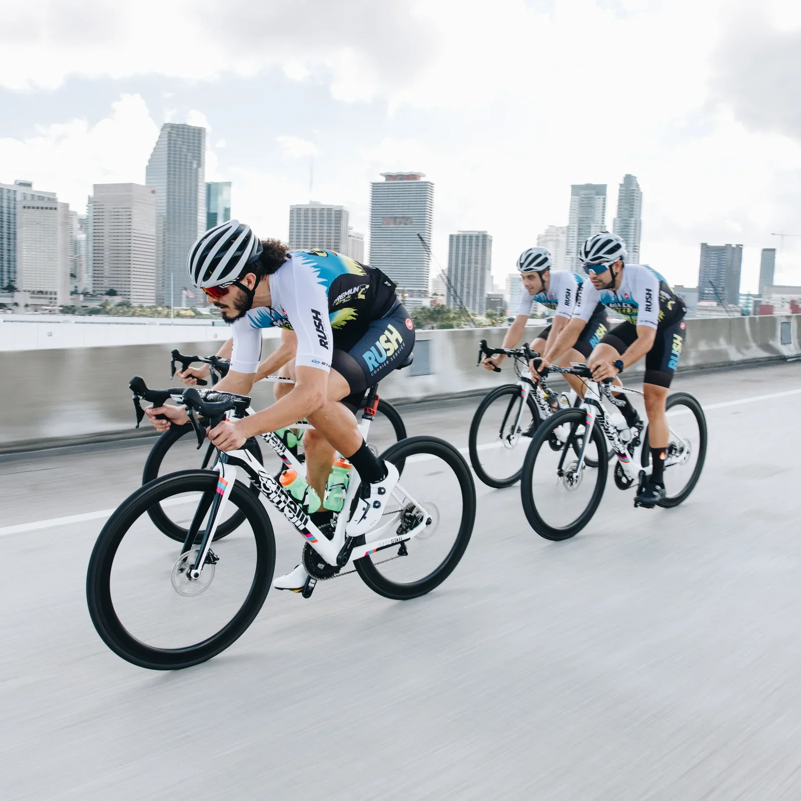
What started as a Miami courier service evolved into something far more ambitious. Over five years, RUSH built itself into a legitimate presence in the pro cycling scene — a scrappy, rider-led team that earned its place through grit and speed rather than deep pockets. When it came time to build a brand that matched that energy, the goal was clear: create something that felt as alive and fast as the riders wearing it.
CHALLENGE
Cycling is a sport where identity travels at speed — a jersey needs to communicate instantly, at 25mph, from the back of a peloton. In an industry prone to following trends, the brief was to do the opposite: build something distinctly Miami, distinctly RUSH, and entirely its own. The color palette was drawn from the city's iconic neon nightlife — vibrant, electric, and immediately recognizable. Typography was chosen for its sense of velocity, and the wordmark was crafted to be legible and striking whether it's on a screen, a kit, or blurring past at race pace.
Role
This project was an exercise in pure craft — translating a team's identity, city, and attitude into a cohesive visual system built to perform in one of the most demanding display environments in sports.